our guest bathroom : the reveal
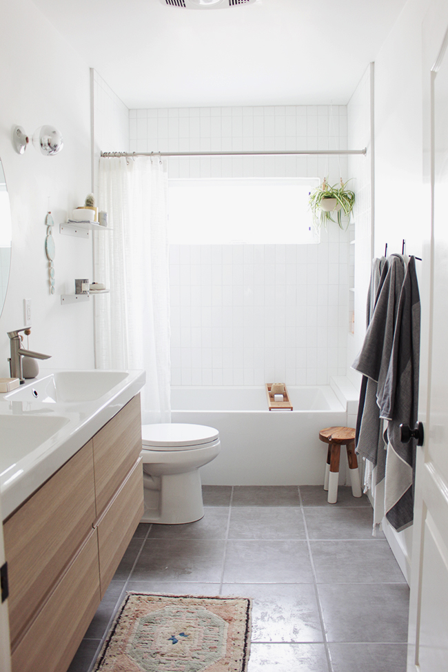
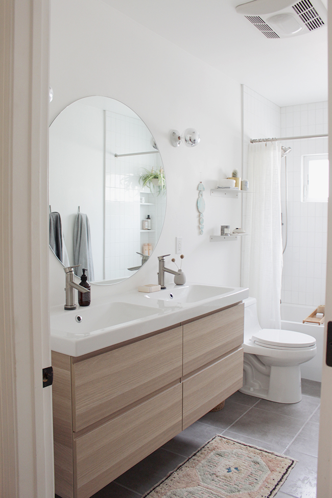
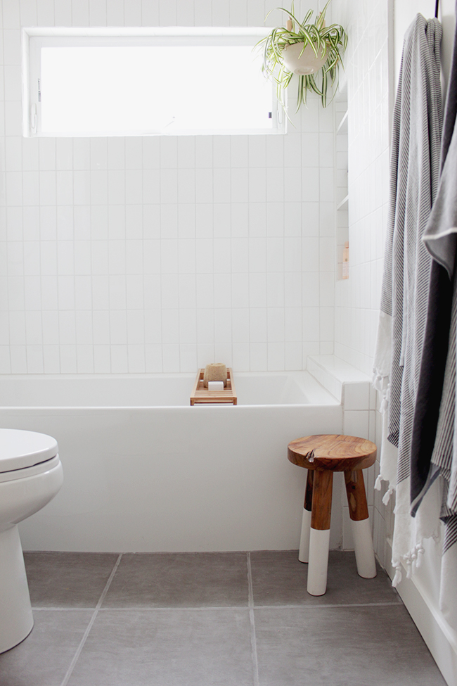
so excited to share the finished bathroom with you! if you forget what the room looked like before, here’s the refresher. we tore everything out and started from scratch, but i still thought it was really important to do everything as affordably as possible — so i made a lot of design decisions that were really inexpensive.
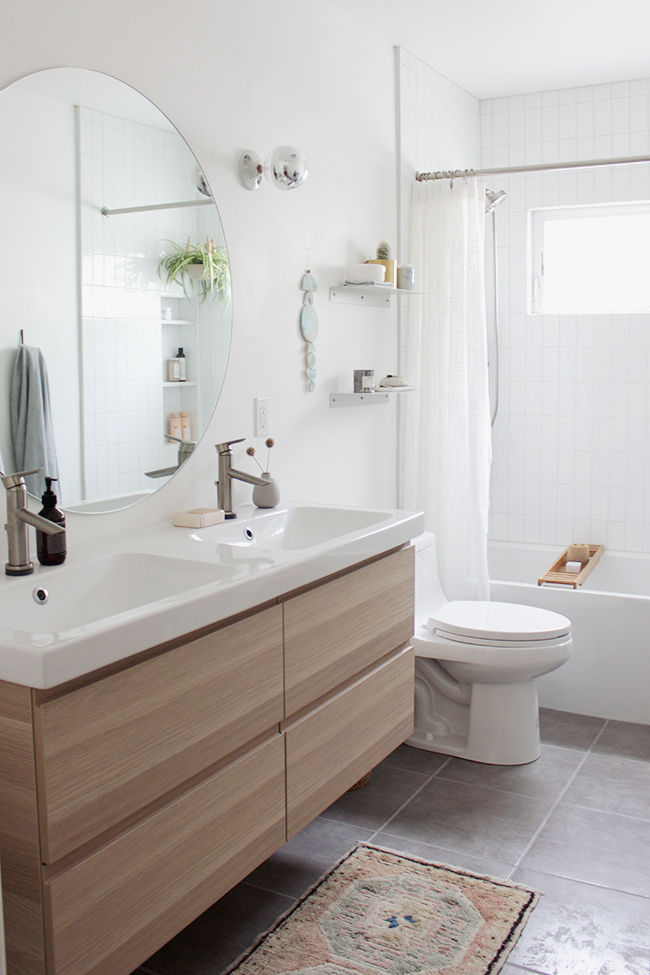
the design of the room is super simple but it’s warm and bright — i also think it’ll stay in style for a long time since i went minimal with every decision.
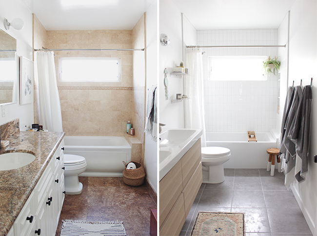 we were on a super time crunch with this reno, i wanted to delay it until after my baby shower since it was at the house, and be done by june for the last few weeks of my pregnancy. i honestly don’t recommend renovations during your third trimester, but you gotta do what you gotta do. i’m just glad it’s done.
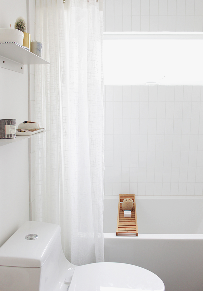
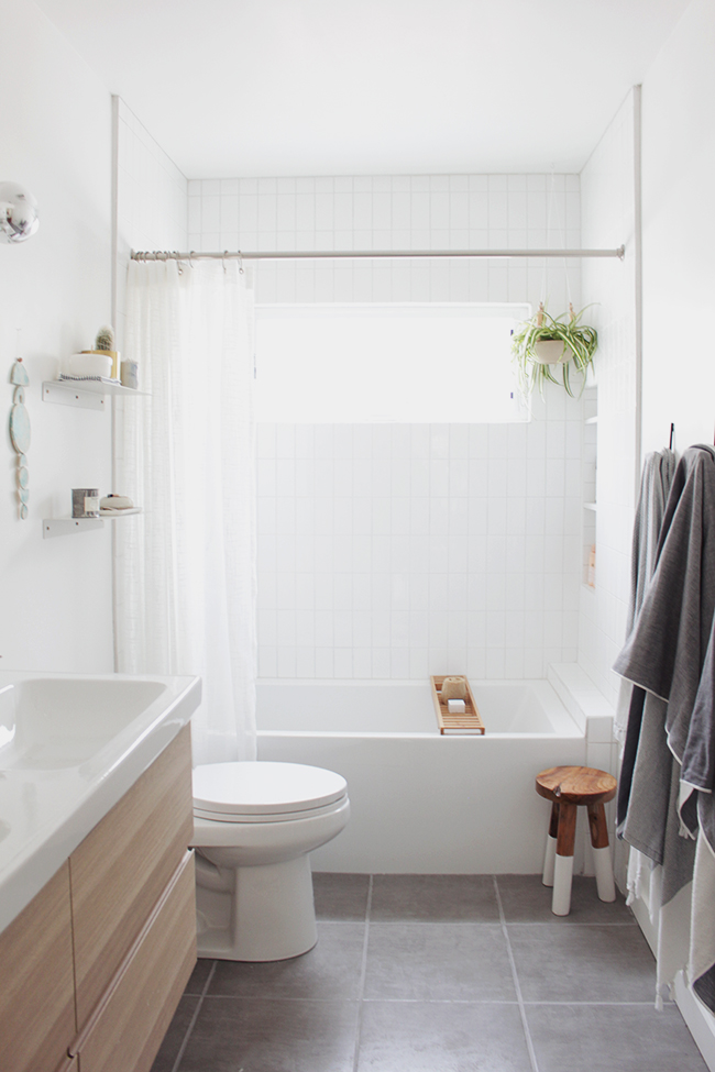
as i said in the design plan post, i wanted to spend as little on tile as possible — and did! i went with standard sized 3×6 white subway tile and made it a little more modern with this vertical stack bond pattern. i reaaally loved the idea of a concrete feel for the floor, but that seemed expensive, annoying for maintenance and like it would take a lot of extra time for pouring and stuff — so i was stoked to find these floor tiles that were so inexpensive and looked and felt very concrete-y.
for the grout, we went with the same white color we did in the kitchen (snow white) and for the floor we went with delorean gray. i briefly considered going with a little bit darker of a grout, but when it came time to building the niche and i realized how much i hate bullnose tiles and wanted to just keep everything right angled, i thought the light grout would be the best. so happy with how it came out.
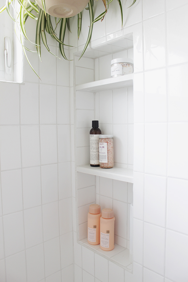
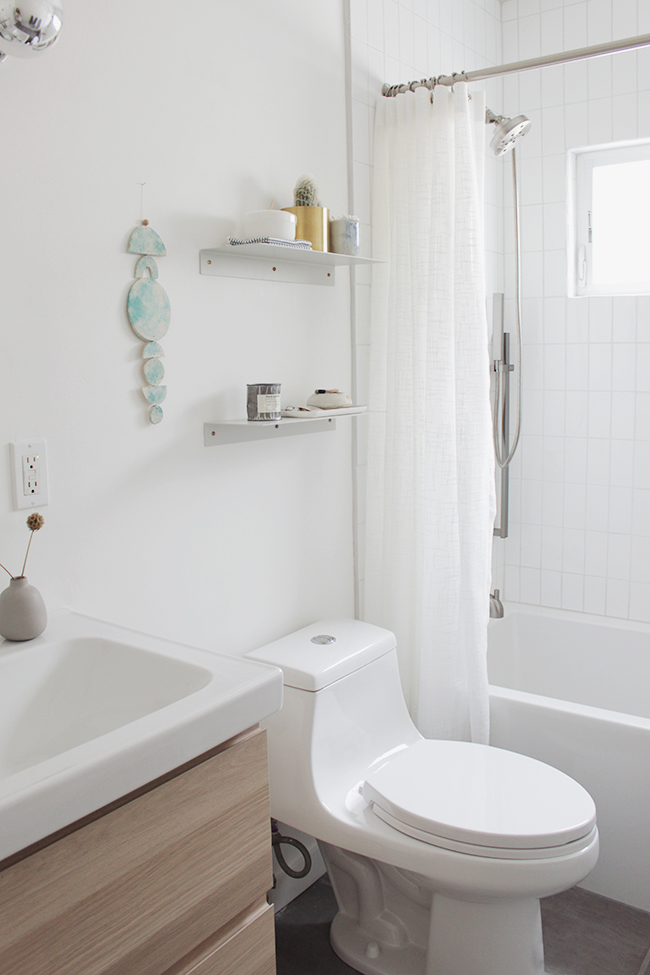
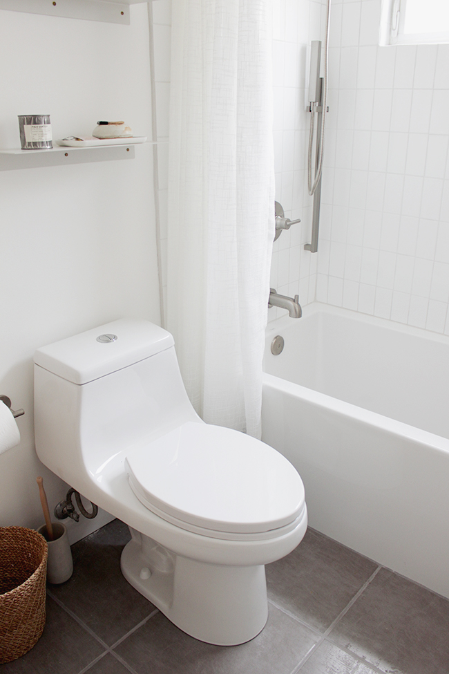
we went with an inexpensive toilet, which works really well so far, and then got ourselves a wider, slow closing toilet seat. that was a VERY good decision because those janky toilet seats feel so bad — i love the one we got. our doody situation is TIIIIGHT.
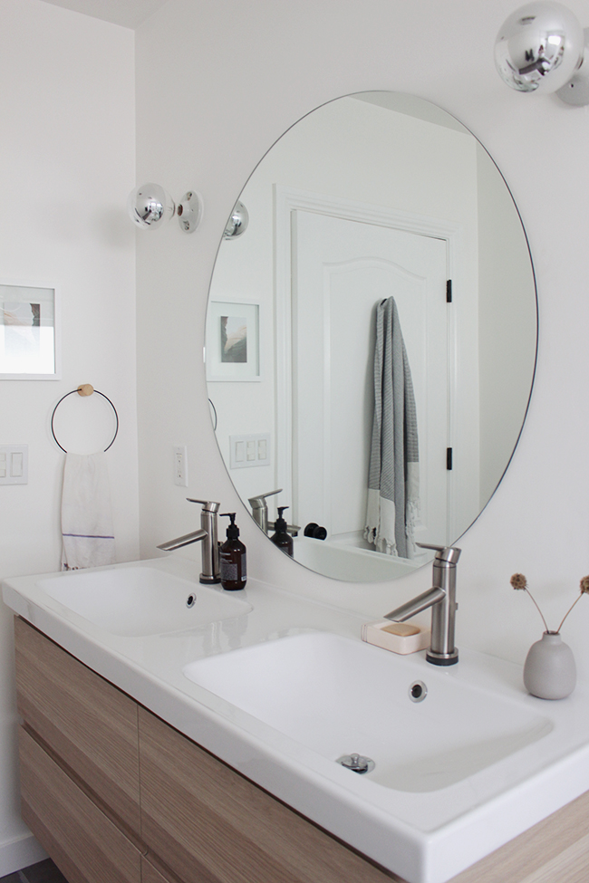
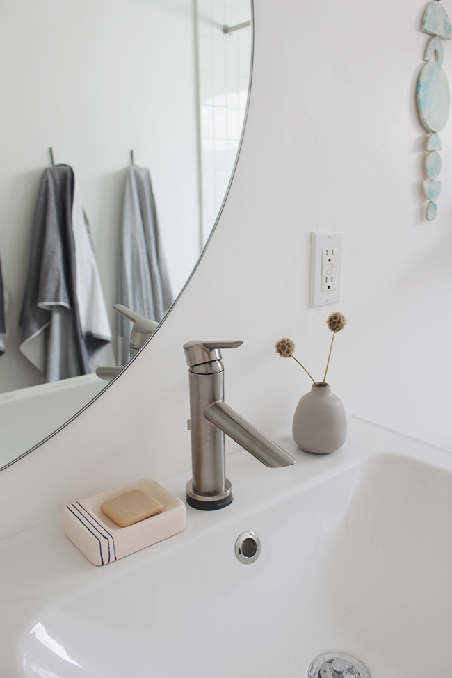
we went with an ikea vanity + sink combo, we tried finding alternatives but there is just nothing close in quality and price — and i really like it. the drawers are big and sturdy and close softly. we used delta faucets instead, which are motion-sensored and it feels sooooo fancy. like our house is a movie theatre.
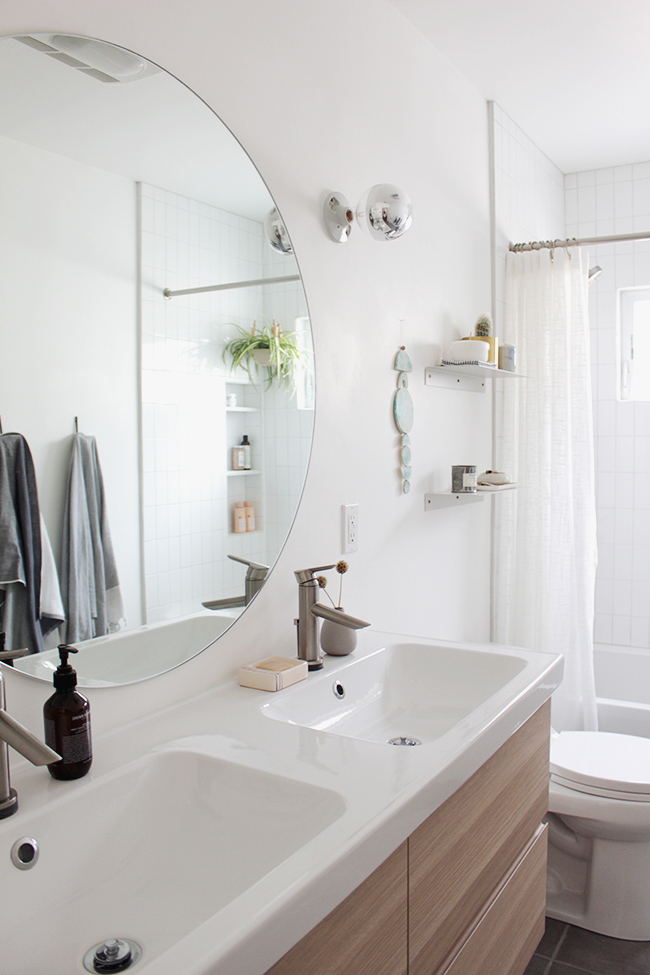
we kept the light fixtures i had swapped out as a cheap temporary fix when we moved in, i’d be up for getting something nicer someday, but these are simple and with these chrome tip light bulbs i really am happy with the look. also the lighting in the evening is super romantic and warm.
i called about 15 different local glass stores and asked them to quote me for a 40″ round mirror cut, most of them said around $250-$300, until one place said $140. the room isn’t huge, but the big mirror makes the biggest difference and it feels so much bigger and brighter.
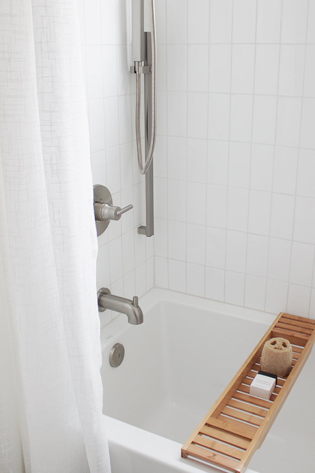
when i saw this tub, i fell in love immediately. it’s deeper than standard sized, which is better for my 6’2″ husband and the apron is so flat and modern and dope looking. i had A LOT of trouble finding tubs with a flat apron!
i went with brushed stainless fixtures and they look really classic and clean. (also a hot tip : if you have fingerprints, use a paper towel with a little baby oil and they look sparkling clean) i initially wanted to do matte black, but instead just mixed in some black accessories and it looks really nice. we live in the valley and i’ve heard that our hard mineral-y water could slowly ruin black fixtures, so i’m a little paranoid (but still might want to use them for the next bathroom). and we got a hand shower! so excited about this, it’ll make bathing the baby so much easier and cuter.


very nice. I love how simply and bright your restroom renovation turns out.
May I ask where did you buy the bar soap holder?
this just made my day! we have three bathroom renovations on our list and the tub was freaking me out. Already bookmarked the tub source. What did you do with old tub and how hard was it to remove? thanks laura
A FLAT APRON TUB! The golden ticket! And inexpensive!
Bless you.
It turned out so clean and modern, I love it! Wish I could do something like this to my grody apartment bathroom, lol
please tell me you have a diy or a source for that blue wall hanging, i’m totally in love!
hey hey! what color wall paint? The world of white wall paint is surprisingly daunting.
Nice works .. 🙂
Excellent Combination of IKEA VANITY + SINK COMBO
Interesting Article! Pinned all images in Pinterest
Bless you
Bathroom goals! ♥
londonkidx.blogspot.com
I’d love to know what your white wall paint is, also! Beautiful transformation here!
For the towel holder, did you spray the metal wire black? What did you use how is it holding up?
Hi! What a beautiful remodel. We have the same sink in our daughter’s bathroom. Would you mind sharing who the mirror fabricator was? $140 is a great deal. Thank you!
I am totally in love on how all of these turned out.
Such an elegant and tidy bathroom . The white color also looks great . Thank you for sharing.
Wow how amazing it is. I am totally in love on how all of these turned out. I was inspired to seeing this and i really want to see this at my bathroom in very next time when i going to remodel my bathroom. Can you tell me from where i can buy these and how much should i spend for this.? Thanks in advance for giving me clarification.
Love love love this bath and planning to use as inspo on our guest bath renovation next month. Would you mind sharing where you had your mirror cut? I live in the LA area so would love the $150 option 🙂
So nice to see such a beautiful bathroom, which are organized in a well-structured way which made me to revamp my bathroom with these designs. Thank you for sharing.
What a gorgeous bathroom! Just wondering if you wouldn’t mind sharing the source for the tile as when you click on the link you provided it does not appear. Did you use glossy or flat? Thank you!!! Your home is beautiful 🙂
Simply beautiful. These elegant designs looks good on spacious and decent bathrooms, especially modern ones. Though the colour combination looks so classy, the wooden work seems to be the most appealing feature!
Great collection 🙂
Nice work! white colour always the best!
Very nicely designed and its simple and all the things are perfectly places, awesome blog. Thanks for sharing. Keep posting your unique ideas.
Awesome design of bathroom and all the things are perfectly placed and spacious too. I liked the white tiles, chrome light bulbs. Thanks for sharing this unique idea.
Nice works! White makes spaces brighter than other themes
Lovely designs! These look just wonderful.
Love both of your bathrooms! Wondering what style/color the Ikea vanity is. The link just goes to the home page.
Your design was very beautiful., And your interior design also cute.
Thanks for sharing this post
Great design ideas. Keep going.
Just mind-blowing. It’s looking so realistic.
Hi – The remodel looks great! I just started looking at tubs and this one is actually the one I keep going back to. Its so hard to tell from pictures, does the back incline enough to be comfortable?
Thanks in advance!
Awesome design, I really loved to see your designs. Vert good work.
wow, nice work!
the link to the wall tiles doesn’t work. do you mind reposting? Thanks!
just updated the link!!