how to create a 5 min gallery wall
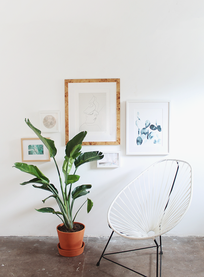
with the holidays coming up real quick, i assume we all want to spruce up our space for holiday entertaining. so today i’m sharing how to upgrade an empty wall with a unique no-fuss gallery wall.
i personally find most gallery walls to be a little… stiff. so i wanted to create one that was a little more organic and unexpected – and EASY.
first off, i used framebridge to frame all of the art. this was the easiest service that i would for sure use again — i was able to mail them the art i had sitting around that i’ve been meaning to frame, and i was also able to upload prints of personal photos i wanted to add to the wall. they arrived framed and ready to hang. i was in love with the big burl wood frame, so i started there and kept the rest of the frames pretty simple.
i’m sure you’ve read tutorials on how to do proper gallery walls complete with tracing the frames with butcher paper, then hanging the butcher paper, then hanging the art over said butcher paper — yeah. i’m not doing that and i’m not going to tell you to either. the only “difficult” thing about this process is making sure you have someone to help. so you might just need to buy someone pizza for helping you.
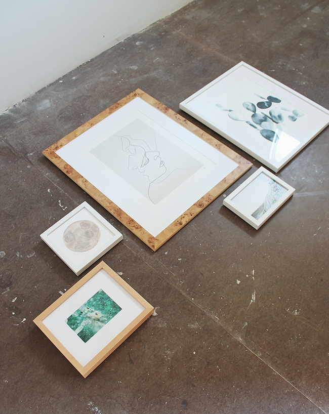
01. lay out the art on the floor the way you want it on the wall. i decided on an unexpected arrangement, and was conscious to not have it look like it was going in any certain direction diagonally. take a photo with your phone of the arrangement in case you forget.
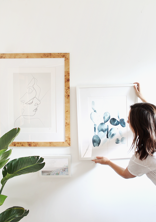
02. if you’re using one large piece of art as your focal point, hang that one first. framebridge came with the hanging mechanisms all set and ready so you don’t need to worry about that. i just hammered a small nail into the wall and hung it up. if you’re a renter, i totally suggest command strips as long as you use the minimum amount of strips (you’ll regret that when you’re taking them down. i learned the hard way).
03. with someone there to help you, hold up your second piece of art where you think you need it. if the frame is larger and has wire in the back, have them put their finger where the nail will actually sit at the highest point of the wire. keep their finger there to mark where you’ll hammer in the nail. hang, step back to make sure it’s straight and move on to the next. so easy!
04. with an organic arrangement like this one, you don’t need to worry about everything being so fussy and uniform. leave negative space and add plants, accent chairs or your TV to create visual interest.
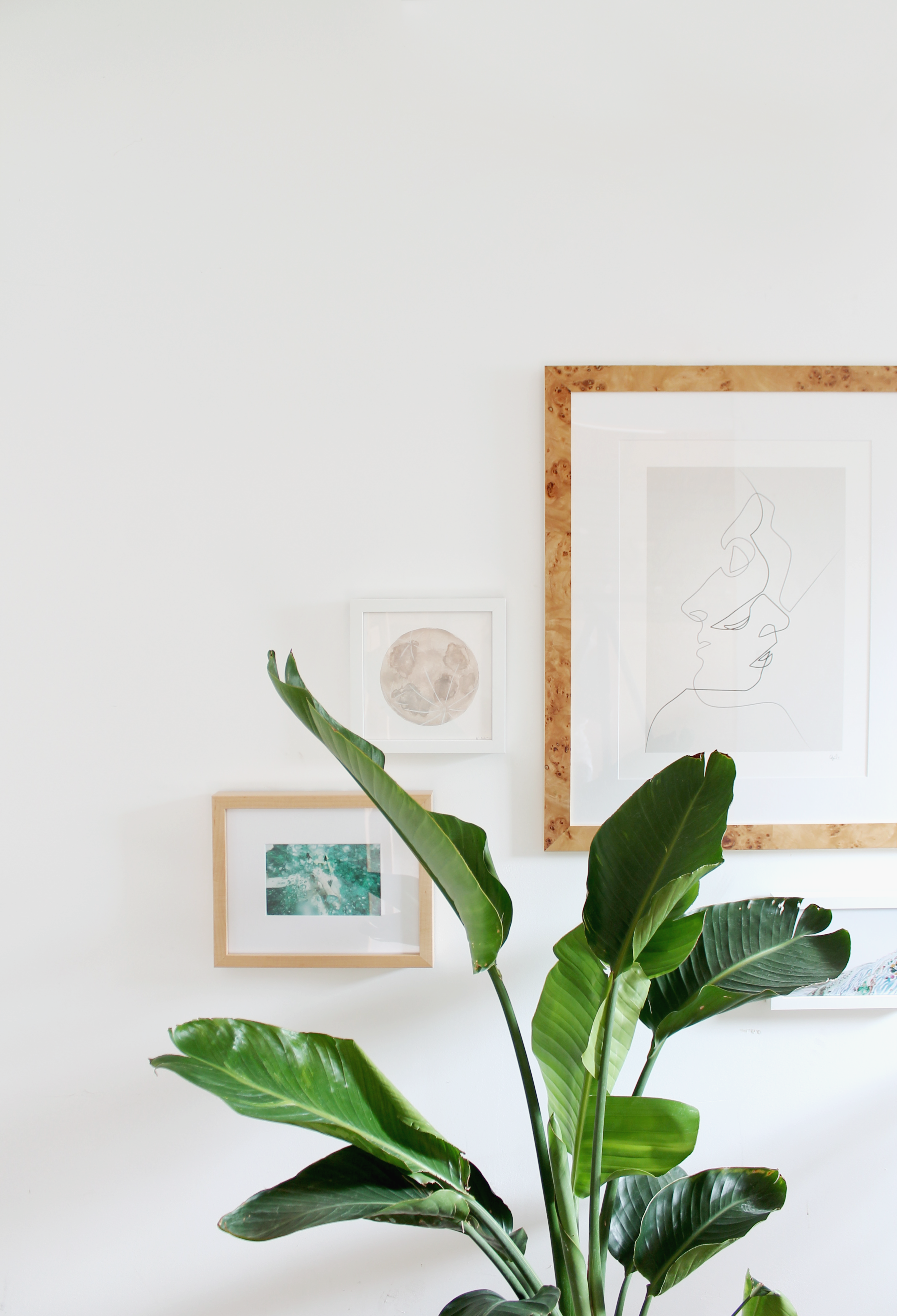
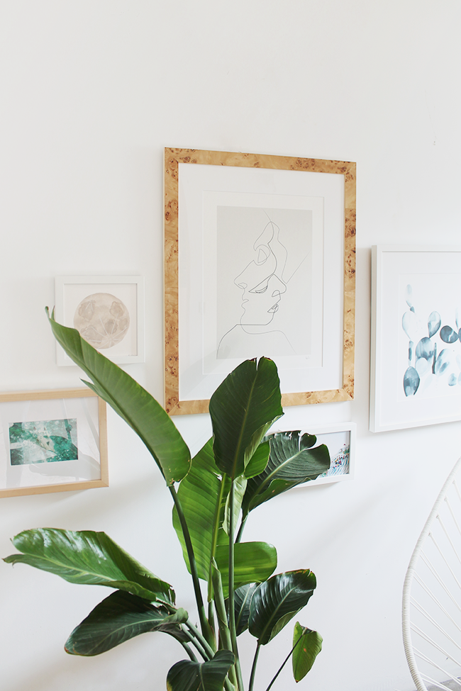
i have to say i am STOKED on this wall. i just keep staring at it and loving the outcome. if you want to try your own, framebridge is offering 20% off your first order! use code ALMOST20 before january 31st!
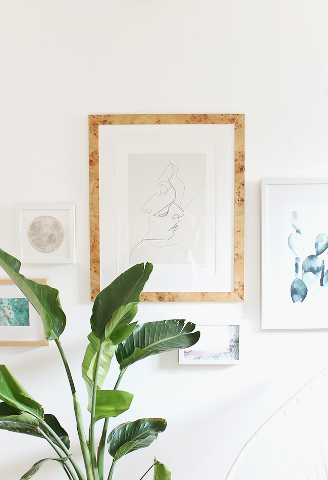
ART SOURCES (LEFT TO RIGHT)
underwater photo of my husband / moon watercolor by claggie / “close” by quib
salvation mountain photo by mary costa / indigo paddle cactus print by the aestate
THIS POST IS IN PARTNERSHIP WITH FRAMEBRIDGE. ALL OPINIONS ARE 100% MY OWN.
THANKS FOR SUPPORTING THE BRANDS THAT KEEPS THIS BLOG GOING!





I apologize if you’ve answered this question before, but where is that glorious chair from? I bought something similar in wicker recently and it’s just not doing it for me. (Thanks!)
Well done! You definitely achieved an organic feel with this one! Love the addition of the plant, fits the arrangement perfectly.